top of page

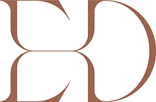
品牌以英文 E、D 為核心,透過標準字的設計手法重新調整字母比例與結構,將兩個字母自然融合,形成簡潔而具有辨識度的字標。造形以流暢、纖細的線條呼應睫毛的輕盈感,同時融入眼睛輪廓的視覺聯想,呈現精緻、優雅且具專業感的美睫品牌形象。
-
The logo is built around the initials E and D, refined through a custom wordmark approach that redefines their proportions and structure. The two letters are seamlessly integrated into a clean and distinctive mark. Delicate, flowing lines echo the lightness of eyelashes while subtly referencing the shape of the eye, creating a refined, elegant, and professional identity for the lash brand.

bottom of page